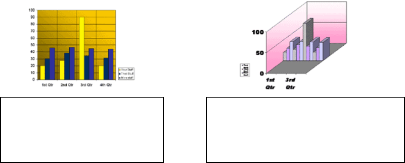
Clear, concise, and easy to read,
your audience will understand
the message of this graph at a
glance.
This 3D graph should be avoided.
Adding a third dimension to a graph with
only two variables is much too
complicated for your audience.
Top Ten Ways to Ruin a Presentation
By Megan Lappi, Gettyworks
Your presentation is a reflection of you. Is it conveying the right message, or just making you
look bad?
Using the right visual elements in your presentation can be a powerful way to enhance your
message. Adding the wrong visual elements or too many of them can easily ruin what
you have to say. Every element in your presentation should complement your message, not
compete with it. So do yourself a favor and don't follow these tips!
1. Use boring images.
Use too many images, images that are too small, or mediocre images with not enough visual
punch. Poor visuals will not only distract your audience, they will also detract from your
message and make you look less professional. Make sure the images you choose suit your
identity and the message you want to convey.
2. Give them tons to read.
As a rule, if it's on-screen, they'll read it from start to finish. So, think about introducing
each new bullet with a mouse click. This cuts down on the amount of information they'll be
introduced to at one time and helps you to explain your point before the audience can make
any prejudgments. Outline your points briefly and effectively on each slide using short
phrases and sentences no more than five bullets per page and five words per bullet.
3. Use complicated graphs and tables.
If they have to spend more than about ten seconds trying to decipher your graph or chart, it's
too complicated! A quick scan of your creation should give the audience an easy
understanding of what you're trying to explain. Make all on-screen elements as simple to
understand as possible.
4. Pack too much visual information onto each slide.
Too much information will overwhelm the audience and distract them from the message. For
maximum impact, keep the number of visual elements down to three per page. For example,
on one slide, you might include four bulleted points, a headline, and one graphic. Above all,
go for simplicity.
5. Choose colors that convey the wrong message.
It may be tempting to combine colors wildly, especially with so many to choose from. But
different colors convey different meanings. Do you know what they are? Make sure your
color choices are simple. It's best to stick to two or three colors per presentation not per
slide. For maximum impact, use the same color combinations in all of your marketing
materials.
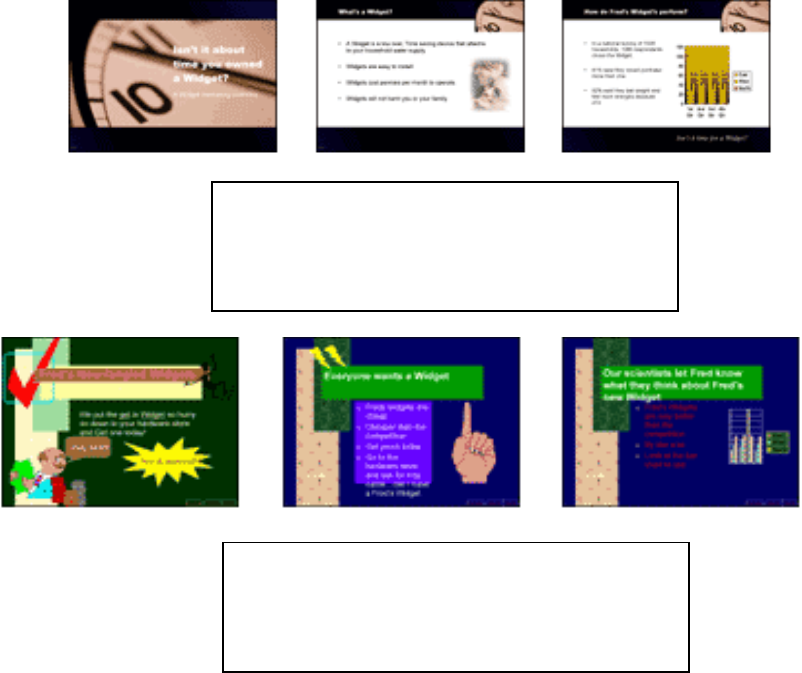
This presentation flows together easily with a
consistent style from slide to slide. The text is
always the same size and color and it appears in
the same place on each page.
This presentation is all over the map. The
composition is inconsistent, the text changes
wildly in size and color, and the key elements are
always in a different place.
6. Don't pay attention to fonts.
Using all caps, all italics or a type-size that's too small and difficult to read will not win over
your audience. Did you know that "sans serif" is the easiest font to read on-screen? A good
rule of thumb is to use 24 point for the body text and 28 point for headlines.
7. Change the "look" from slide to slide.
You might think that a good jolt will keep your audience awake, but your presentation will
pack more power if it flows together easily, so keep your visuals consistent.
8. Use the templates that come with your presentation package.
Would you like to be unique, or just lope along with the rest of the pack? If you use
PowerPoint® templates, your presentation will likely get lost with everyone else's. We admit
we're a little biased, but we have absolutely no doubt you'll get their attention with one of our
original templates.
9. Experiment with too many slide transitions.
The transitions should be so seamless that the audience doesn't even notice them. Use a
maximum of two transition types and stick to them!
10. Use tons of animations & sound effects.
Animations and sound effects can be a nice addition to your presentation unless you overdo
them. Don't just add dazzling effects because you can. As with everything else, use them
sparingly and make sure they fit your message.
